 YardMate
Accessibility in practice
The same garden, however you reach it.
Gardening is a slow, tactile, deeply personal thing. None of that should depend on being able to see a screen clearly, hold still, or read small type.
Seven things YardMate does with what iOS already provides. Each is shown on a real screen with the relevant setting turned on in Settings › Accessibility — there is no separate “accessible mode” to switch on inside the app.
One
Ask the garden out loud, and answer it out loud
Hands wet, phone on the bench, kneeling by a pot: this is the moment care usually goes unrecorded. Ask from the Home Screen and Siri answers with YardMate’s own card — what needs water today, each plant with a Water button that logs the care right there. The app never comes forward. Watering and feeding can be logged the same way, and every one of these actions is also a Shortcuts tile, for the Home Screen, the Lock Screen, or an automation.
Siri & App IntentsYou say “Siri, what should I water today in YardMate?”
Two
The whole answer, before you open anything
The reminders widget sits on the Home Screen and answers the only question that matters before you go outside: what needs you today. Every row carries the plant, the task, the interval and the time — a whole instruction, not a number floating next to an icon — so the garden gets checked without the app being opened, or even reached for.
Home Screen widget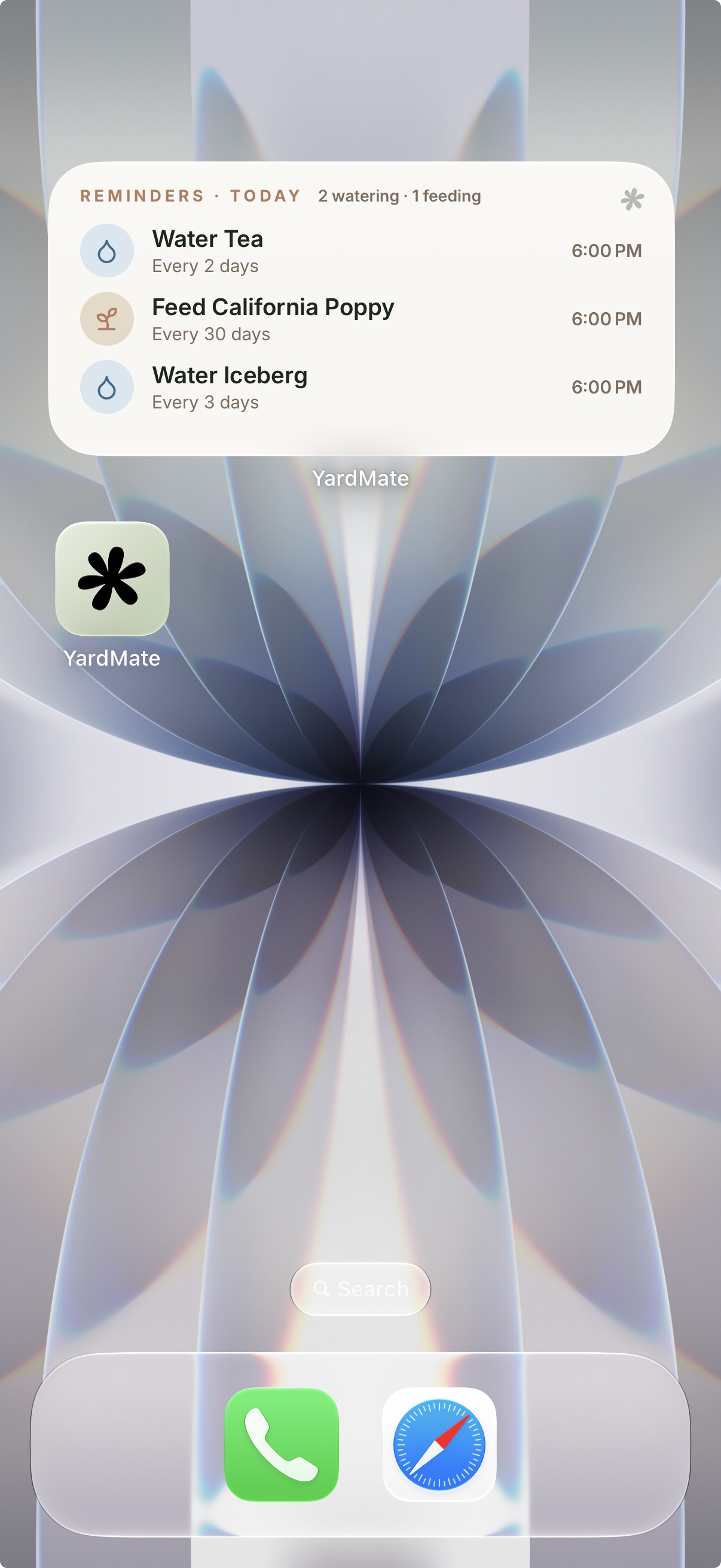
Three
Identify a plant, hear how to care for it
A plant is photographed, identified, added to the garden — and then read back. The photo at the top is not left as a decorative slab: it announces which of the plant’s pictures it is, that it can be opened, and what opening it does. It does not repeat the plant’s name, because the heading above has already said it. Below, each care row is grouped so it arrives as one instruction rather than a number stranded beside an icon.
VoiceOver on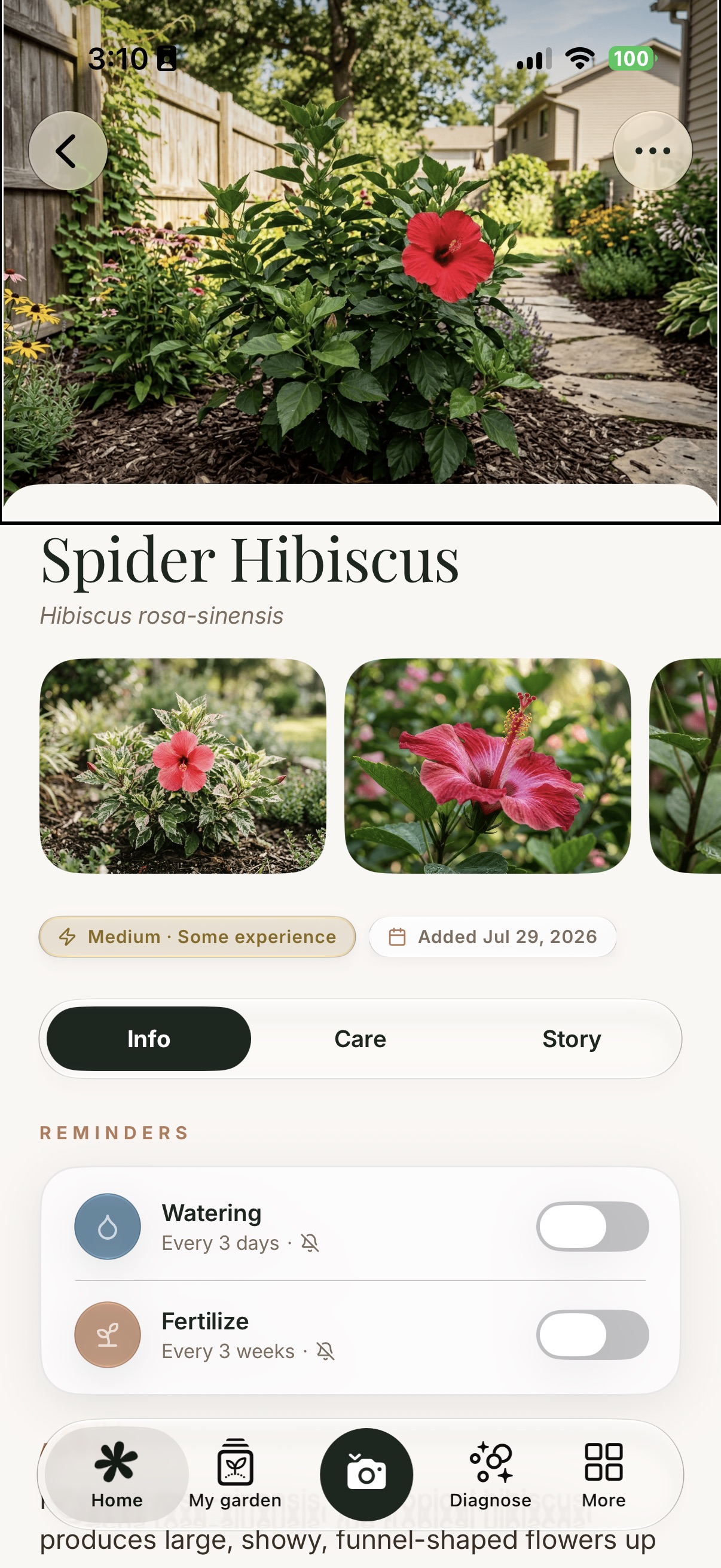
VoiceOver “Opens the full screen photo, actions available. Fence, foliage, garden, path, red flower, wood natural, wood processed.”
Four
The main screens at the largest text size
With the system text size raised to its largest accessibility setting, type scales and the layout scales with it. Icons grow alongside their labels, and rows become taller rather than tighter, so a care card turns into more lines instead of a truncated one.
Largest accessibility text size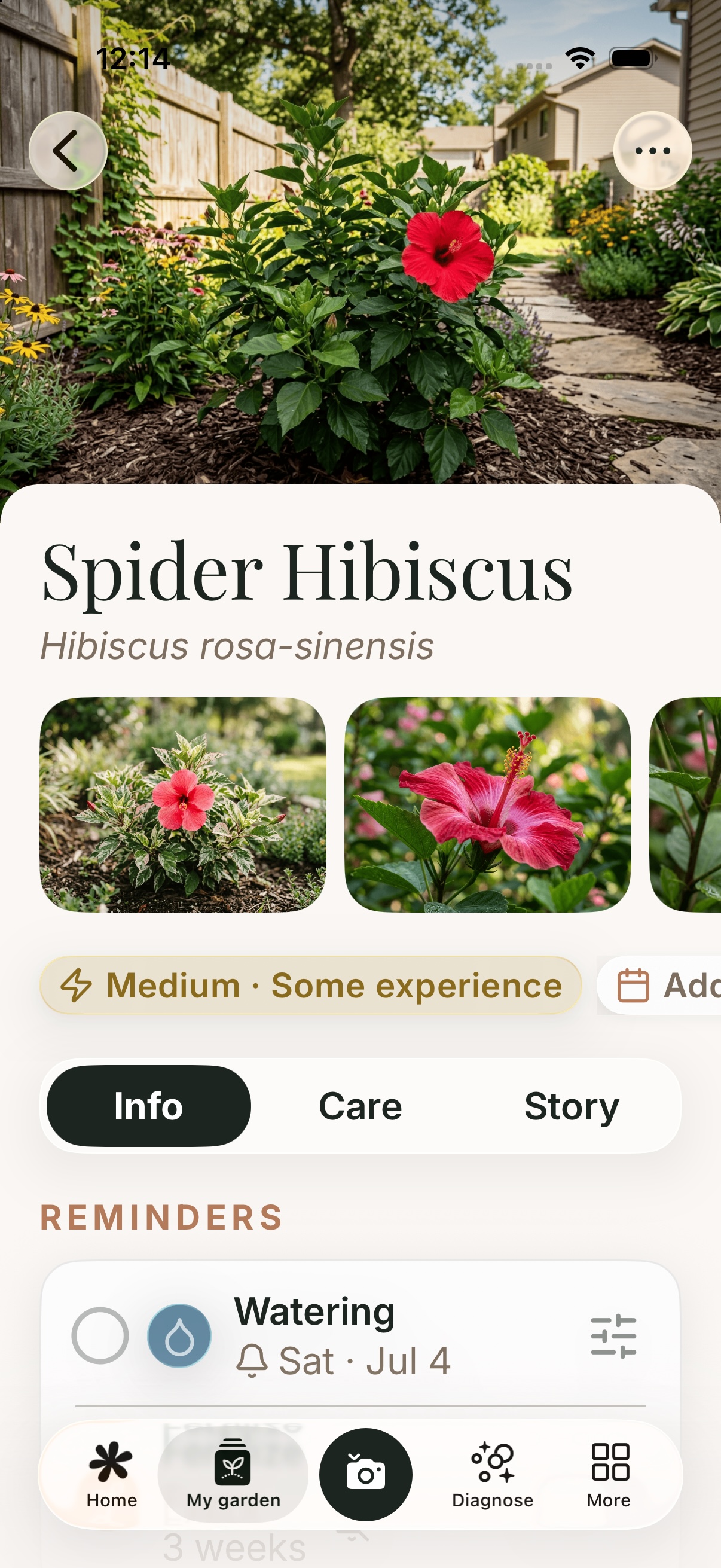
Five
The same wait, without the movement
While a photo is being identified, a band of light sweeps down it and the outline of the plant fades in — the app showing its work. With Reduce Motion on, the sweep is not played faster or dimmed: it is not drawn at all. The contour is placed once and held, the progress bar carries the waiting, and the step reads exactly the same — you simply are not asked to watch anything move.
Reduce MotionSix
A map that does not rely on colour
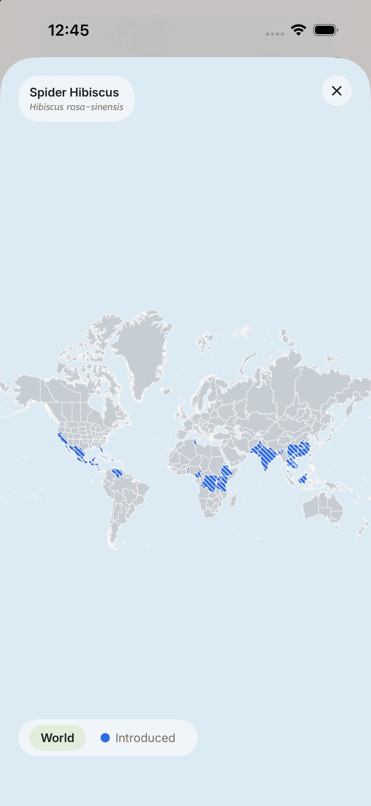
Every plant carries a world map of where it grows, and by default the regions are read by colour alone — which is no use if that is exactly the distinction you cannot make. With Differentiate Without Color on, the filled regions are hatched instead, so the shape carries the meaning and the legend still matches what is on screen.
Differentiate Without Color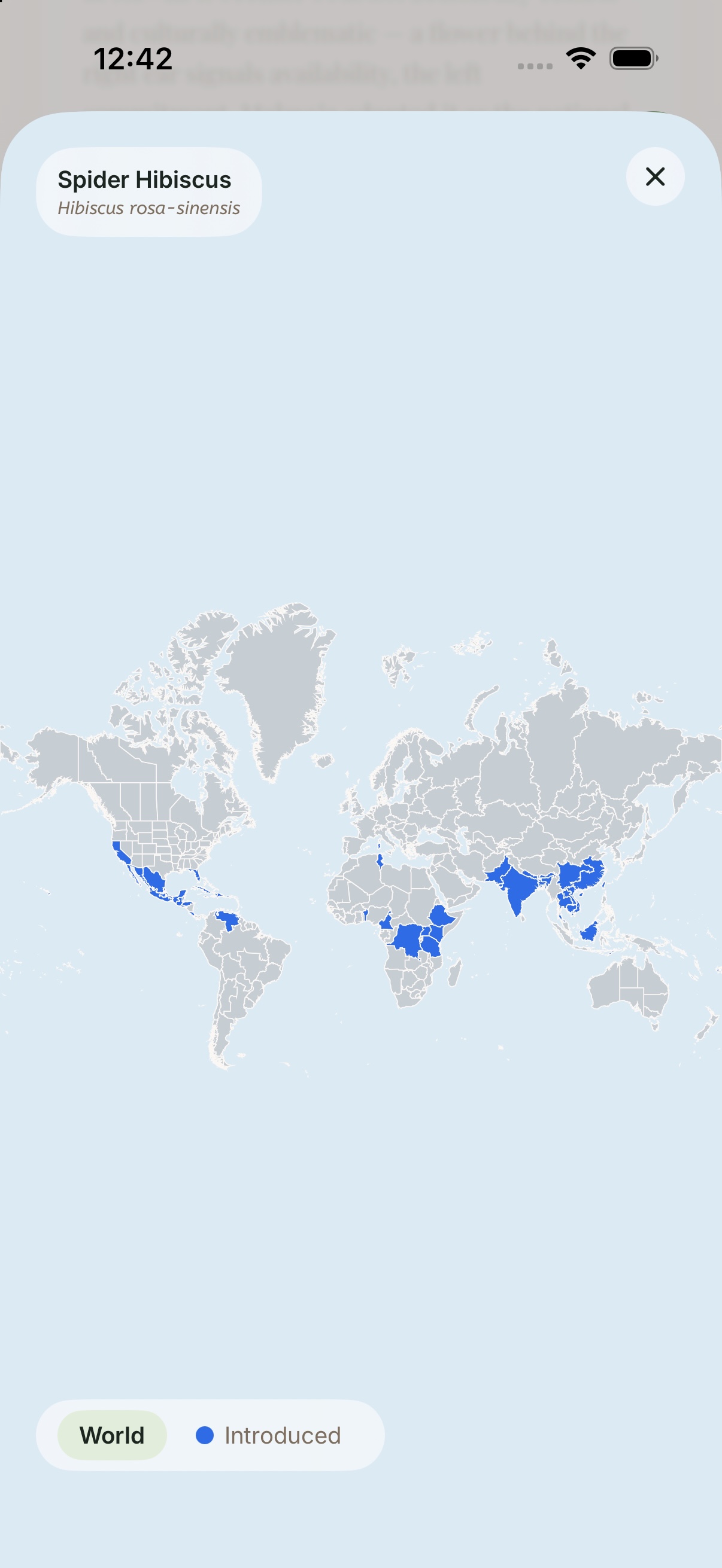
Seven
Cards that draw their own edges
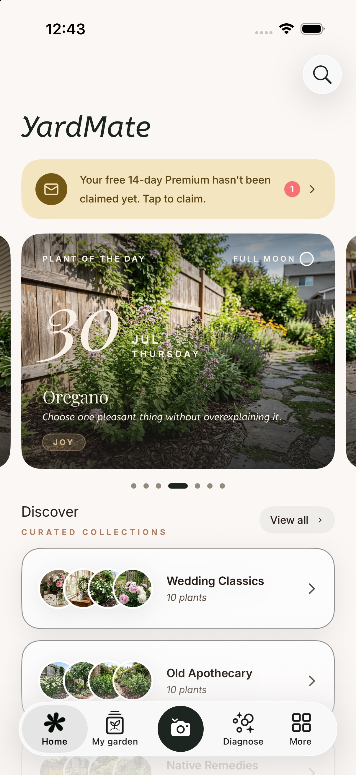
YardMate’s surfaces are soft on purpose — warm paper, low-contrast cards, edges suggested by shadow rather than drawn. That is a style, not a requirement. With Increase Contrast on, every card takes a real border and the soft separations become explicit ones, so nothing depends on a shadow being visible to you.
Increase Contrast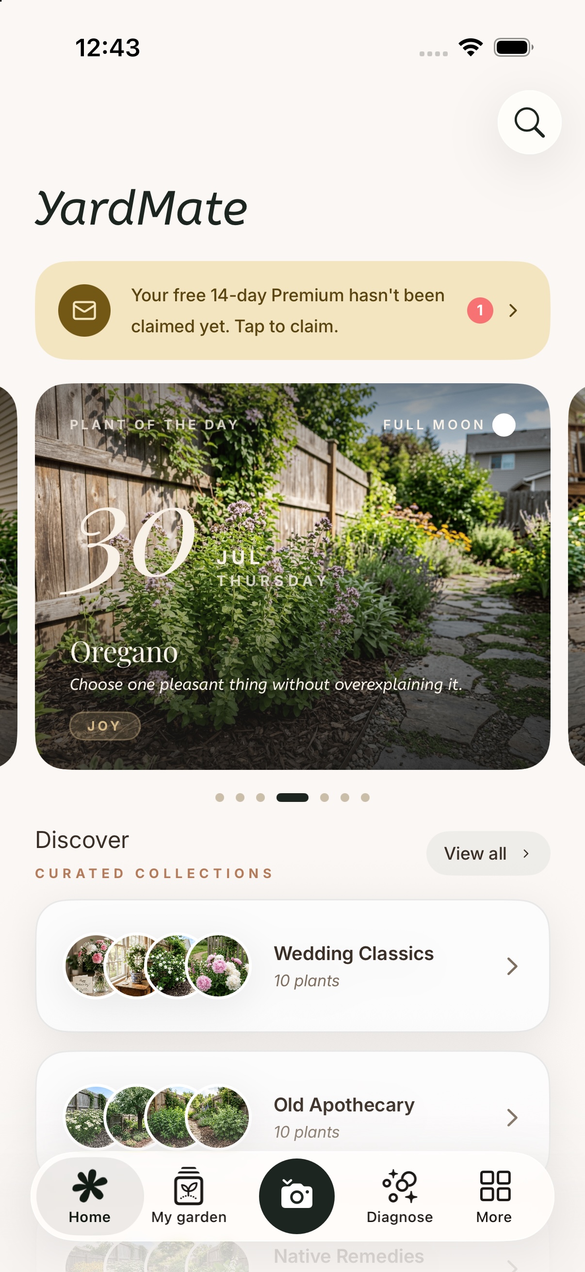
A note from the maker
YardMate is made by one person, and this page exists because of a single belief: whatever difficulties someone lives with, they have the same right as anyone to know nature and to observe it closely. A garden never asks who you are before it blooms, and an app about gardens shouldn't either. So the labels, the larger type and the quieter animations here aren't items on a checklist. They are a door held open, so that naming a flower, reading its story and caring for it day by day can belong to everyone.
If something here doesn't work for you, or could work better, I'd honestly like to hear it: hello@yardmate.ai.